In this post we will be reverse engineering a magazine spread from the Bon Appetit magazine. Bon Appetit is a food and entertainment magazine. Their magazines usually include recipes, reviews, and cooking or baking tips. The following magazine spread comes from the February 2013 edition of the Bon Appetit magazine. I got this picture of the magazine spread from http://susietheodorou.com/galleries/bon-appetit-pasta. Because the image didn’t come from Bon Appetit’s official website I couldn’t find who the designer, author, or recipe creators were.
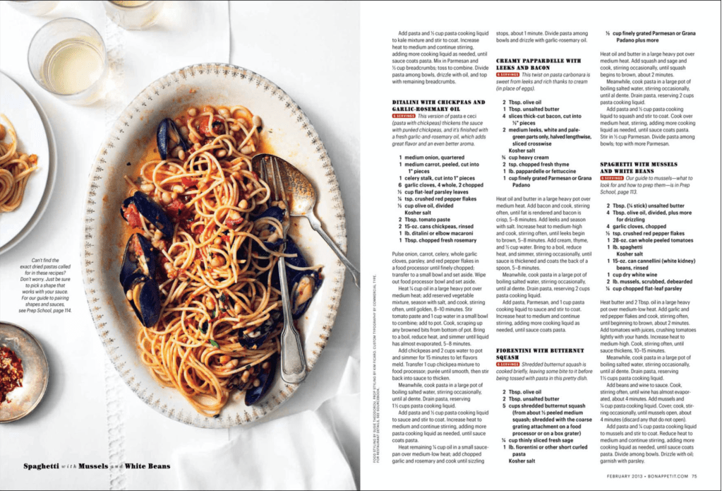
First we are going to be doing a deep dive into the typeface of the article. I feel that Bon Appetit did a really good job with this one. They kept the style within their company brand as having a simple and professional look, they were also able to really keep the readability as well which is really important for the recipes that were included. However, even with it being simple and readable it is appealing and has variation. The headings were done in a Slab Serif font (accented in blue). While the rest of the writing was done in a Sans Serif font. They also bolded the ingredient lists for the recipes (accented in red) to give more of a contrast in the style and add to the readability of the recipes.
I feel that the photography was well done for this post. The Rule of thirds is really interestingly done. The food itself isn’t directly on those lines, however the fork is. To me that seems to emphasize that you are drawn to the object that is going to be helping you to eat the food. I also like how the left side of the plate lines up with it, as well as the decorative stitches in the tablecloth. The food on the smaller plates on the left also align with the rule of thirds.

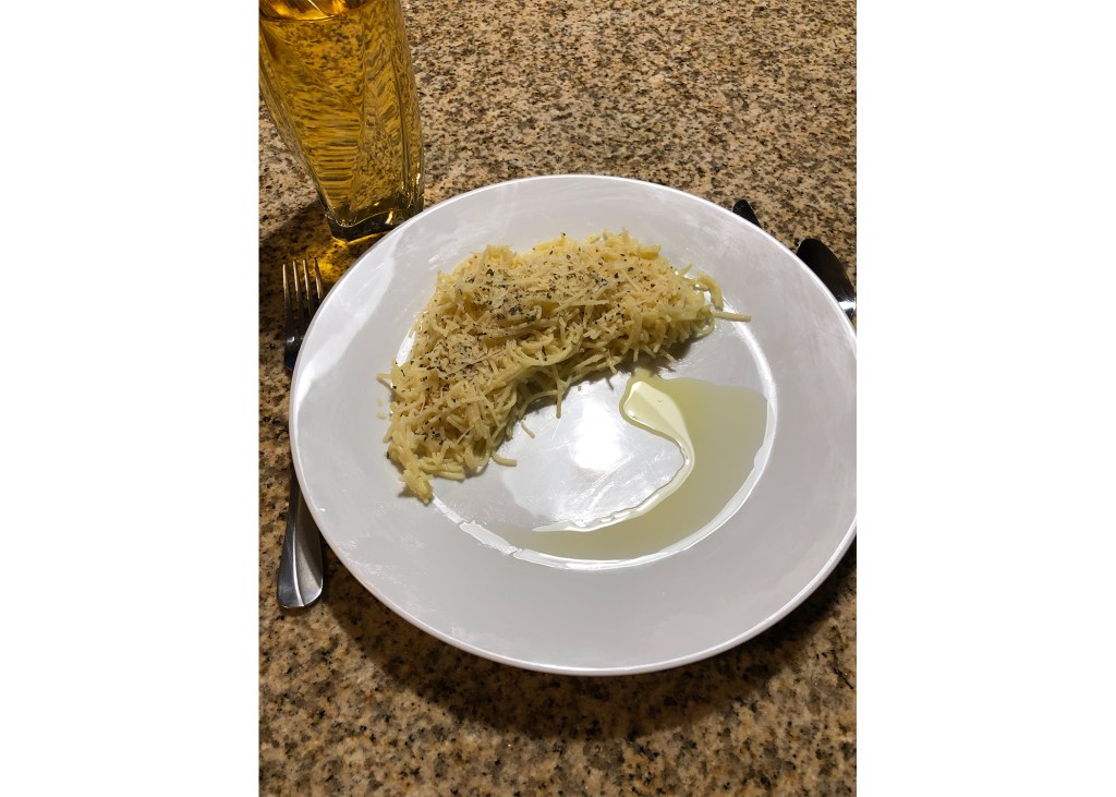
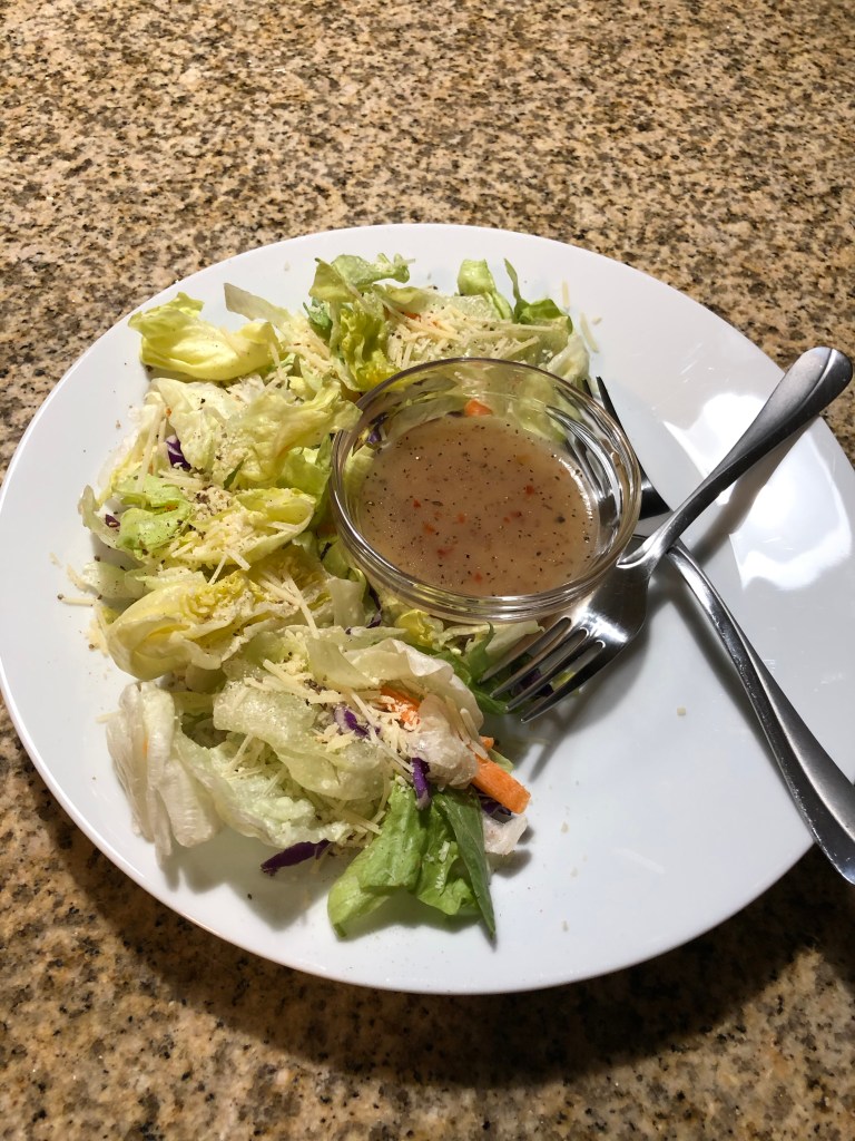
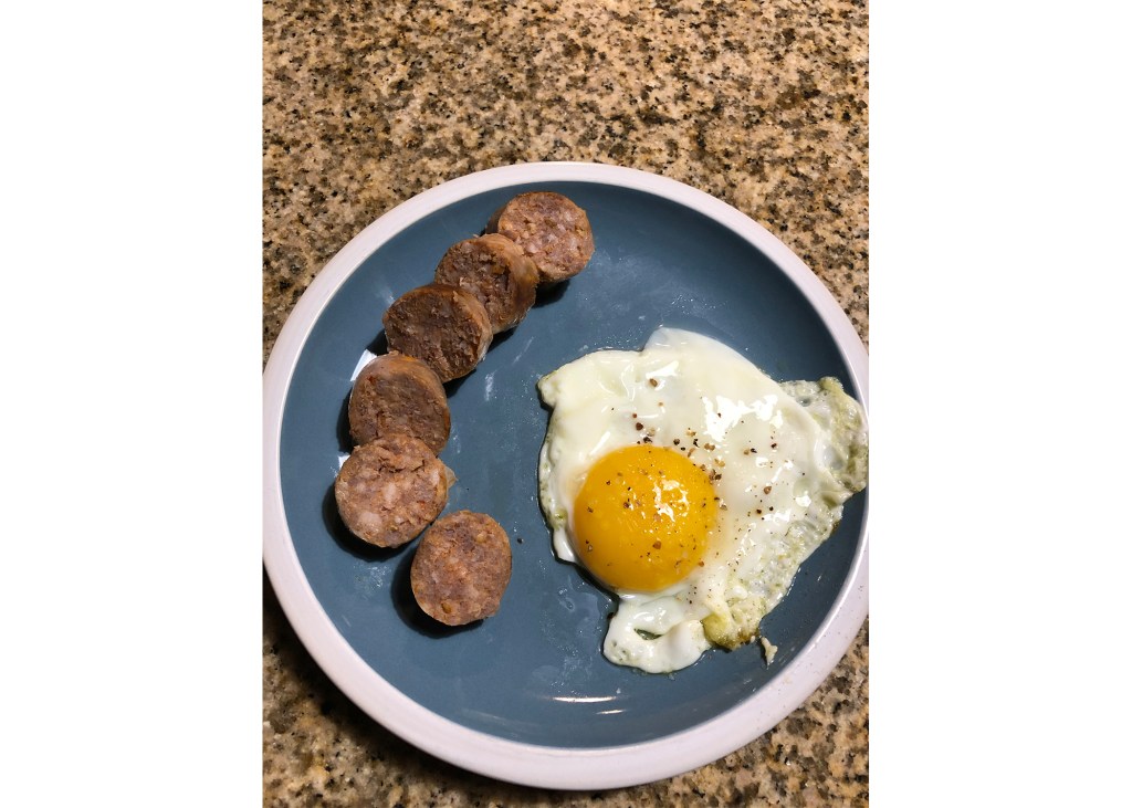
Below I have attached some photos I took trying to replicate the style of the food photography. I tried to capture some of the same elements and style types that they have. However, I don’t have a great camera or professional chef plating skills to make the food look amazing on the plate.
In conclusion, the principles of typography and photography are very important in designing a professional look. When you are able to effectively pair those principles to your work, it will look much more professional and appealing to the eye.
