Advertising is an essential part of every business! It can be a great force for growing a customer base and the reputation of the company. However, if not done effectively it can tarnish a companies reputation. One company that seemingly has mastered advertising within its brand is The Walt Disney Corporation for its movies as well as its theme parks.
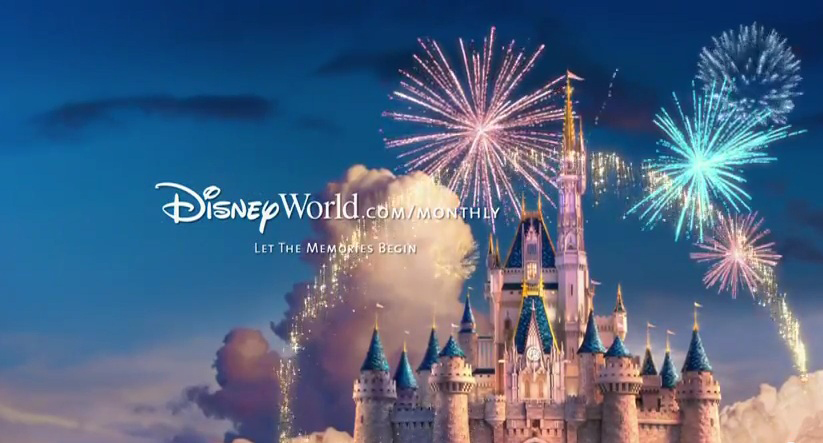
Pictured above is an example of a Walt Disney World Resort advertisement. This ad is promoting their annual passes. It is a relatively simple ad however it really fits within Disney’s brand image. It features the famous Cinderella Castle found in the Magic Kingdom Park in Walt Disney World. It also features the fireworks which are a common sight at Disney World. Though the wording is simple “Let the memories begin” It is clear that they are inviting you to capture the magic of Disney by visiting the website and purchasing tickets.
This ad does a great job of incorporating colors that really add to the Disney Magic. There is a lot of hues of pink and blue which are common Disney colors. You can also see a lot of contrast in lighter and darker colors. This makes the castle stand out agains the sky as well as the fire works really jump out as well.
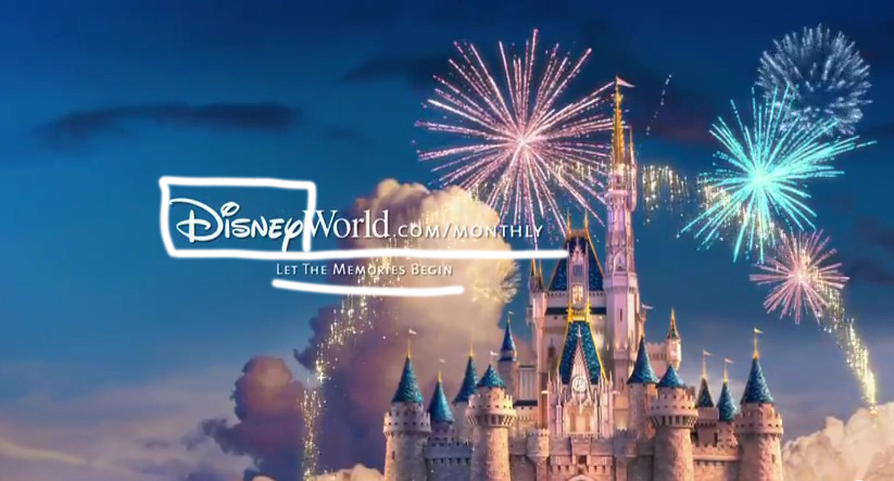
The typography in this ad is very simple yet effective. The designer uses the Disney logo within the website address. This ads a great variety by adding a decorative font (boxed above) as well as keeping branding consistent. They also used a very simple sans-serif (underlined above) font to make the rest very easy to read.
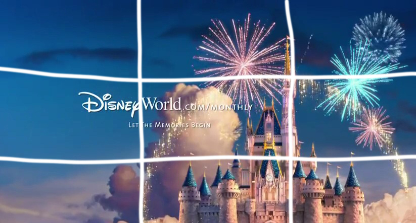
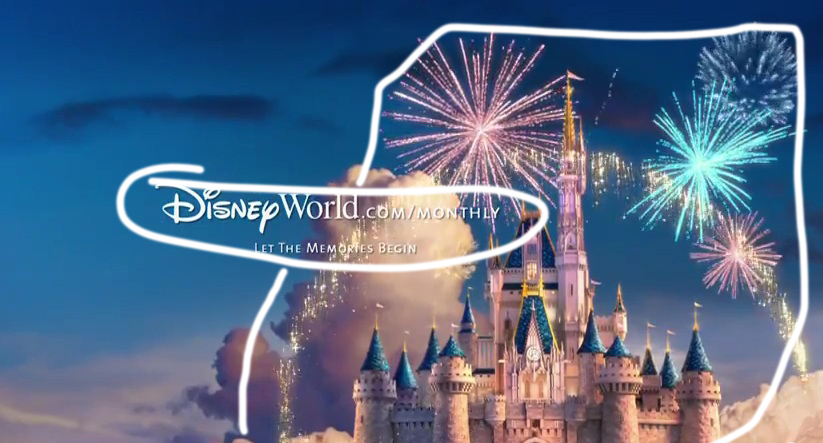
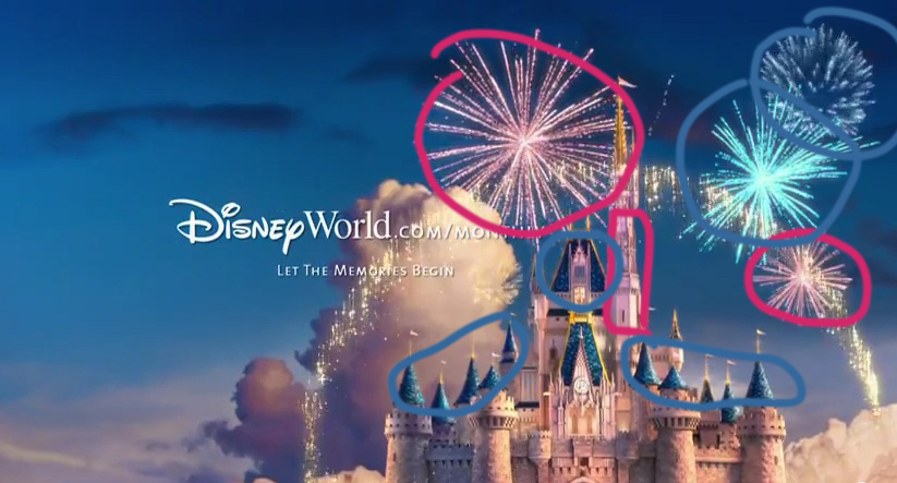
Disney also did a great job of incorporating strong design elects within the ad. You can see the elements of repetition, alignment, and proximity. The repletion happens within a couple of different elements, you can see it in the use of clouds as well as in the colors. There are clouds all across the ad giving it a feeling as though the castle is flying. The repletion in the colors is quite apparent as well as you see a lot of blues and pinks. This is within the fireworks, the castle, and even in the sky. The alignment is also great you can see that tall spire of the castle is on one of the lines of the rules of thirds and the top of the Tinkerbell pixy dust is aligned with it as well. With proximity you see the text is all close together indicating that they are related. There is also the proximity of the fireworks and pixy dust close to the castle showcasing the magic of Disney World.

Within my Disney ad (pictured above) I tried to make an ad that truly could be in the same campaign as the professionally designed one from Disney. I featured another famous Disney World icon, the Spaceship Earth ride in Epcot. I also used the same website link featuring the Disney logo as well as a catchline under that.
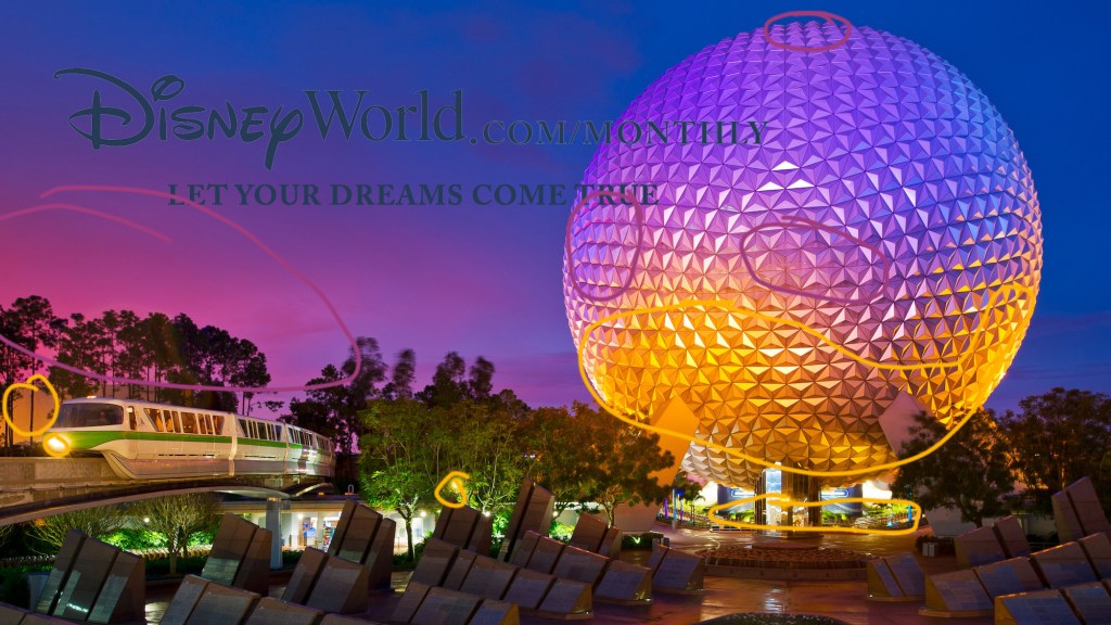
For color I found a photo from Disney that captured a futuristic feel because that is more of the focus in Epcot at Disney World. So I found this that has purples and yellows as well as the deep blues. This is reflected in the sky as well as in the lighting and reflections of the Spaceship Earth dome.
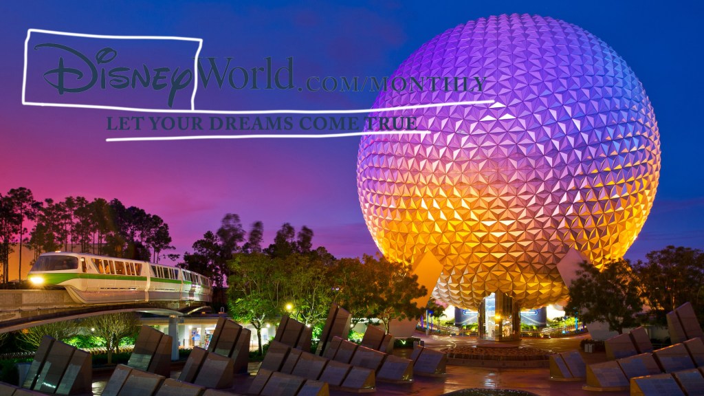
With my typography I tried to mimic that of the original ad. I had the Disney World logo within the website URL then added more easily readable Sans-Serif font fort he catchline underneath as well as the .com/monthly. I also copied the style of the Disney World logo, including the color as well as the outline in the lighter gray color.
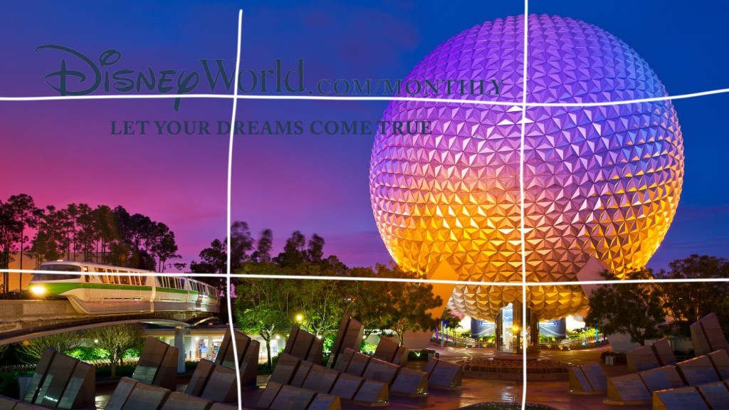

Design I tried to capture a lot of the same design elements that were captured in the original ad. I could have done better in adding repetition to the ad. I did find one that had quite a few of the colors repeated, however, it didn’t go much beyond that. I think I did a lot better with proximity. I found an image that followed the rule of thirds well as making sure to group the text like the original did so as to capture the relation between the two. And my alignment I tried to make sure that the typography was well aligned with the other aspects of the image, especially that of the monorail train.
In conclusion, I tried to make sure that my ad that I created fit the Disney Brand, and matched the other ad in style so as to be a part of the same ad campaign. You can see a lot of the similarities between the two ads as you compare them side by side. This includes elects of the photos that were used, to the typography and text.
