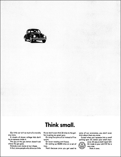
VW’s Think Small campaign, designed by Doyle Bernbach, is a staple when it comes to marketing and advertising. Bernbach used many radical designs for the time to create the ads. The quirkiness of the advertising matched that of the car. Because of this Think Small is one of the most successful advertising campaigns of all time; it was able to take Volkswagen from an obscure little German car to a major automobile manufacturer in the United States and around the world. This advertisement would make its subject car, the Beetle, the best selling car of its time and still to this day one of the most successful vehicles of all time.
In order to achieve the striking design, Bernbach did something that hadn’t really been done before in American marketing pre 1960. One of the radical designs was his use of contrast. He made the advertisement just black and white, a stark contrast to the standards of car advertising at the time. It also created a sharp contrast in the ad itself to have a little black VW in a sea of white blank space.
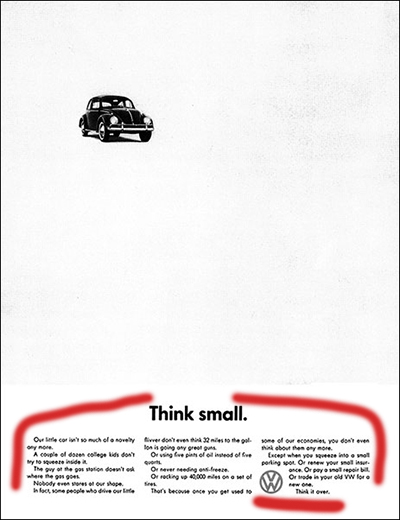
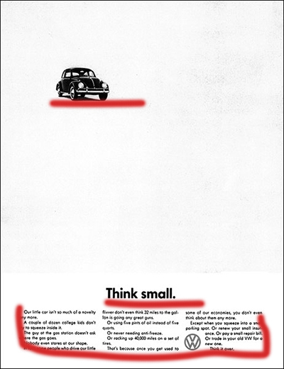
Within VW’s marketing there were many similar ads. They really used repletion across the whole range of ads making them instantly recognizable as a VW ad. They always featured a black and white car and then a title with some text underneath. This was the simple formula and Bernbach didn’t depart from this style.
Doyle Bernbach did as much as he could to give the VW Think Small Ads an understated appeal. With his alignment he used the most common, and what is usually considered boring, alignment for his test. He just centered it. The only slightly out of the ordinary alignment within the ads was the VW logo aligned on left side of the text in the far right column.
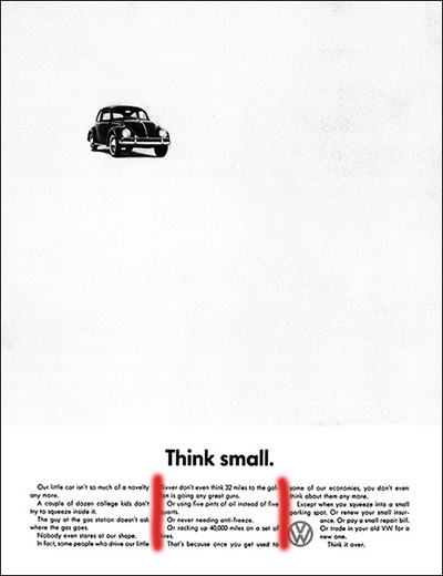
Bernbach took a very unique stance with relation to proximity. He only used proximity with the text it was all in a paragraph from at the bottom and put the VW. However, the photo of the Beetle itself was kept far away from the rest of the ad, but because of the simplicity of the ad you know that it all relates.
Though all of the previously discussed items were quite radical for the time, the lack of color was the biggest shock to people. At the time, most car ads were very vibrant and colorful to show the luxury and how beautiful they were. But with the VW ads Bernbach decided to go for a minimalist and understated approach in the aforementioned was as well as in color, or the lack thereof. The ads were all printed in a barren black and white color scheme. This added to the minimalistic look of the ads.
Because how strikingly different the ads were to anything else at the time, they really caught peoples attention. They weren’t the most beautiful, they didn’t follow so closely the rules of visual media and design, or the trends of the time, but that is what makes them so great. They purposefully broke the rules and because of their willingness to go outside the box and do something so radically different they had immense success in building VW to what it is now, the largest automaker in the world!
