Be yourself; Everyone else is already taken.
— Oscar Wilde.
This is the first post on my new blog. I’m just getting this new blog going, so stay tuned for more. Subscribe below to get notified when I post new updates.
Be yourself; Everyone else is already taken.
— Oscar Wilde.
This is the first post on my new blog. I’m just getting this new blog going, so stay tuned for more. Subscribe below to get notified when I post new updates.
Advertising is an essential part of every business! It can be a great force for growing a customer base and the reputation of the company. However, if not done effectively it can tarnish a companies reputation. One company that seemingly has mastered advertising within its brand is The Walt Disney Corporation for its movies as well as its theme parks.
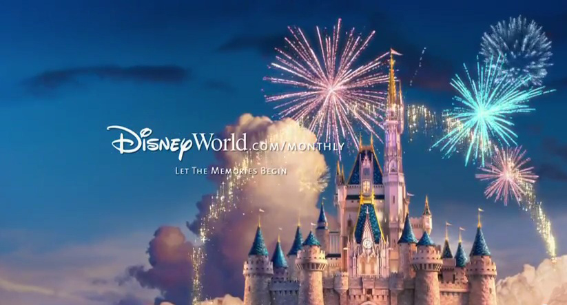
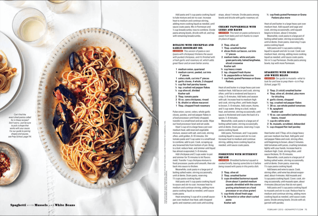
Pictured above is an example of a Walt Disney World Resort advertisement. This ad is promoting their annual passes. It is a relatively simple ad however it really fits within Disney’s brand image. It features the famous Cinderella Castle found in the Magic Kingdom Park in Walt Disney World. It also features the fireworks which are a common sight at Disney World. Though the wording is simple “Let the memories begin” It is clear that they are inviting you to capture the magic of Disney by visiting the website and purchasing tickets.
This ad does a great job of incorporating colors that really add to the Disney Magic. There is a lot of hues of pink and blue which are common Disney colors. You can also see a lot of contrast in lighter and darker colors. This makes the castle stand out agains the sky as well as the fire works really jump out as well.
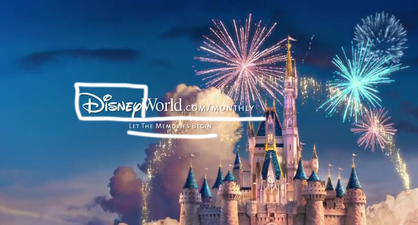
The typography in this ad is very simple yet effective. The designer uses the Disney logo within the website address. This ads a great variety by adding a decorative font (boxed above) as well as keeping branding consistent. They also used a very simple sans-serif (underlined above) font to make the rest very easy to read.
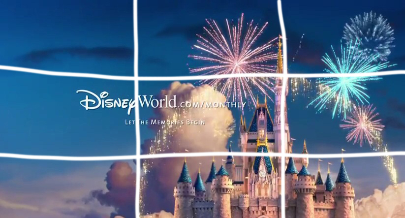
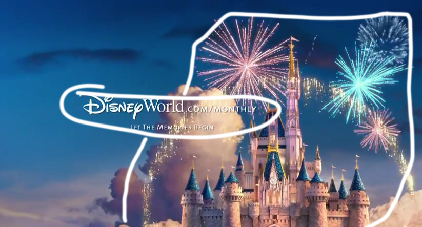
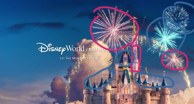
Disney also did a great job of incorporating strong design elects within the ad. You can see the elements of repetition, alignment, and proximity. The repletion happens within a couple of different elements, you can see it in the use of clouds as well as in the colors. There are clouds all across the ad giving it a feeling as though the castle is flying. The repletion in the colors is quite apparent as well as you see a lot of blues and pinks. This is within the fireworks, the castle, and even in the sky. The alignment is also great you can see that tall spire of the castle is on one of the lines of the rules of thirds and the top of the Tinkerbell pixy dust is aligned with it as well. With proximity you see the text is all close together indicating that they are related. There is also the proximity of the fireworks and pixy dust close to the castle showcasing the magic of Disney World.

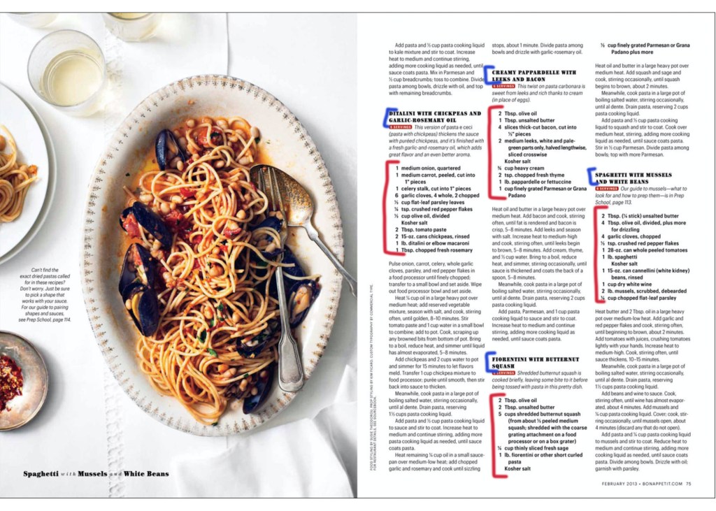
Within my Disney ad (pictured above) I tried to make an ad that truly could be in the same campaign as the professionally designed one from Disney. I featured another famous Disney World icon, the Spaceship Earth ride in Epcot. I also used the same website link featuring the Disney logo as well as a catchline under that.
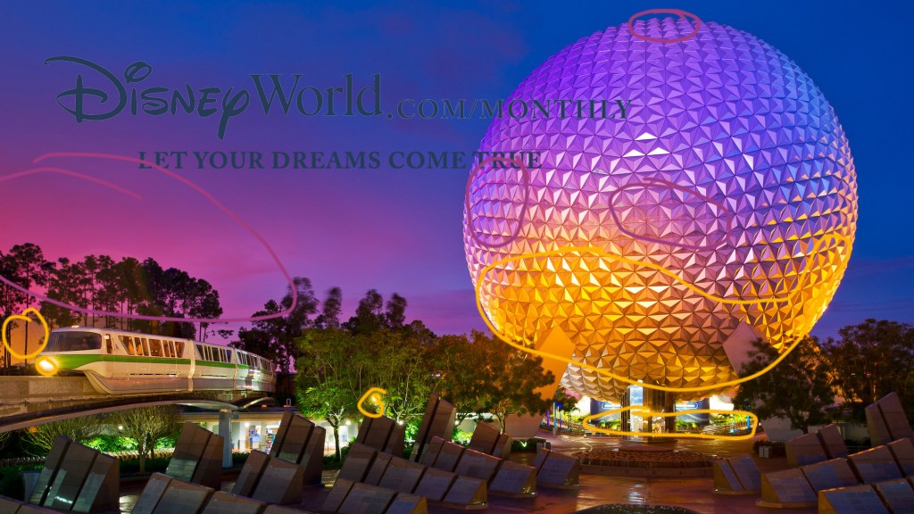
For color I found a photo from Disney that captured a futuristic feel because that is more of the focus in Epcot at Disney World. So I found this that has purples and yellows as well as the deep blues. This is reflected in the sky as well as in the lighting and reflections of the Spaceship Earth dome.
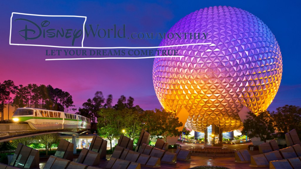
With my typography I tried to mimic that of the original ad. I had the Disney World logo within the website URL then added more easily readable Sans-Serif font fort he catchline underneath as well as the .com/monthly. I also copied the style of the Disney World logo, including the color as well as the outline in the lighter gray color.
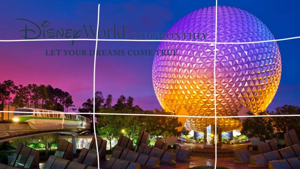

Design I tried to capture a lot of the same design elements that were captured in the original ad. I could have done better in adding repetition to the ad. I did find one that had quite a few of the colors repeated, however, it didn’t go much beyond that. I think I did a lot better with proximity. I found an image that followed the rule of thirds well as making sure to group the text like the original did so as to capture the relation between the two. And my alignment I tried to make sure that the typography was well aligned with the other aspects of the image, especially that of the monorail train.
In conclusion, I tried to make sure that my ad that I created fit the Disney Brand, and matched the other ad in style so as to be a part of the same ad campaign. You can see a lot of the similarities between the two ads as you compare them side by side. This includes elects of the photos that were used, to the typography and text.
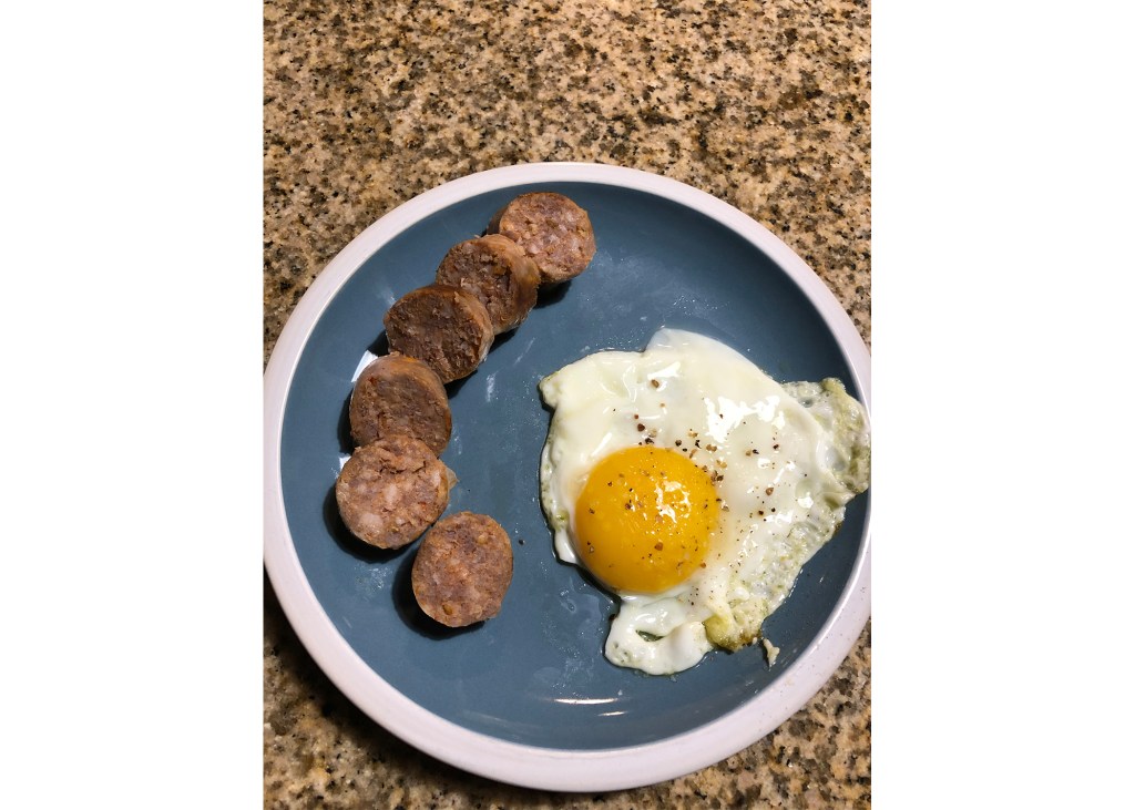
In this post we will be reverse engineering a magazine spread from the Bon Appetit magazine. Bon Appetit is a food and entertainment magazine. Their magazines usually include recipes, reviews, and cooking or baking tips. The following magazine spread comes from the February 2013 edition of the Bon Appetit magazine. I got this picture of the magazine spread from http://susietheodorou.com/galleries/bon-appetit-pasta. Because the image didn’t come from Bon Appetit’s official website I couldn’t find who the designer, author, or recipe creators were.
First we are going to be doing a deep dive into the typeface of the article. I feel that Bon Appetit did a really good job with this one. They kept the style within their company brand as having a simple and professional look, they were also able to really keep the readability as well which is really important for the recipes that were included. However, even with it being simple and readable it is appealing and has variation. The headings were done in a Slab Serif font (accented in blue). While the rest of the writing was done in a Sans Serif font. They also bolded the ingredient lists for the recipes (accented in red) to give more of a contrast in the style and add to the readability of the recipes.
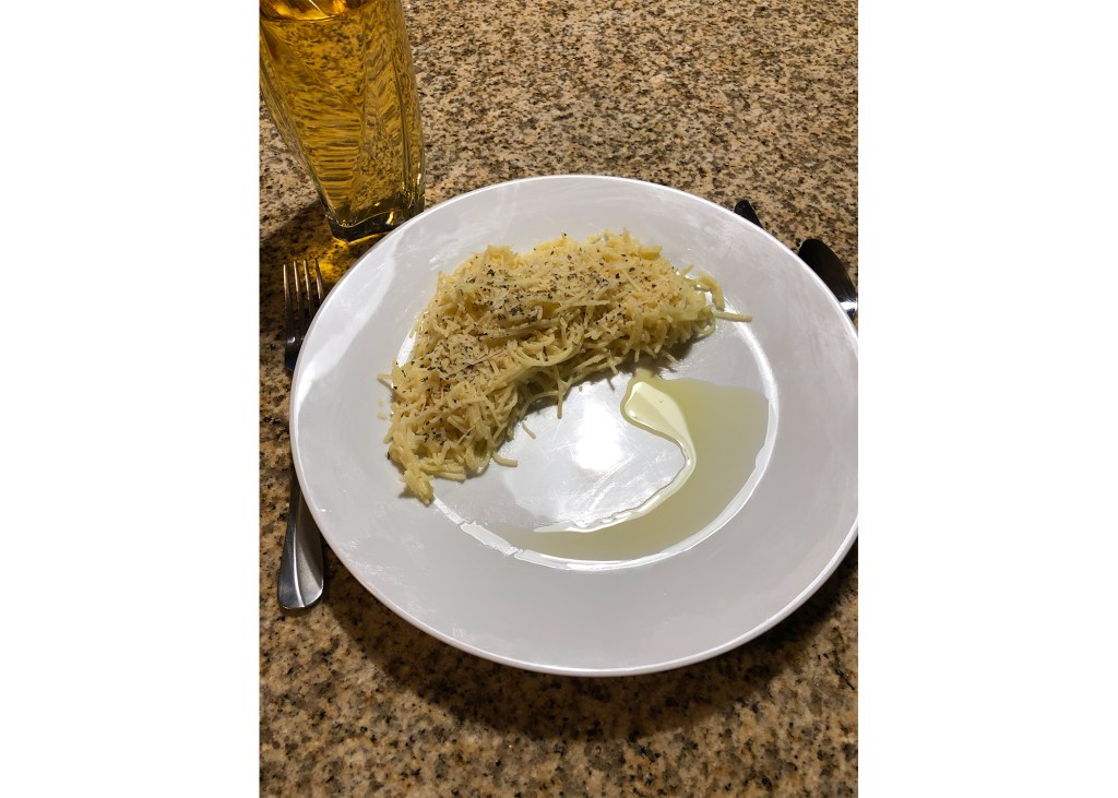
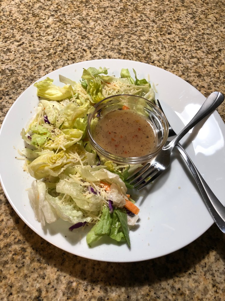
I feel that the photography was well done for this post. The Rule of thirds is really interestingly done. The food itself isn’t directly on those lines, however the fork is. To me that seems to emphasize that you are drawn to the object that is going to be helping you to eat the food. I also like how the left side of the plate lines up with it, as well as the decorative stitches in the tablecloth. The food on the smaller plates on the left also align with the rule of thirds.

Below I have attached some photos I took trying to replicate the style of the food photography. I tried to capture some of the same elements and style types that they have. However, I don’t have a great camera or professional chef plating skills to make the food look amazing on the plate.
In conclusion, the principles of typography and photography are very important in designing a professional look. When you are able to effectively pair those principles to your work, it will look much more professional and appealing to the eye.
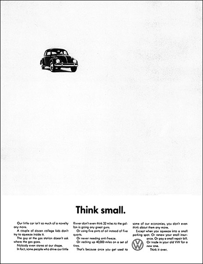
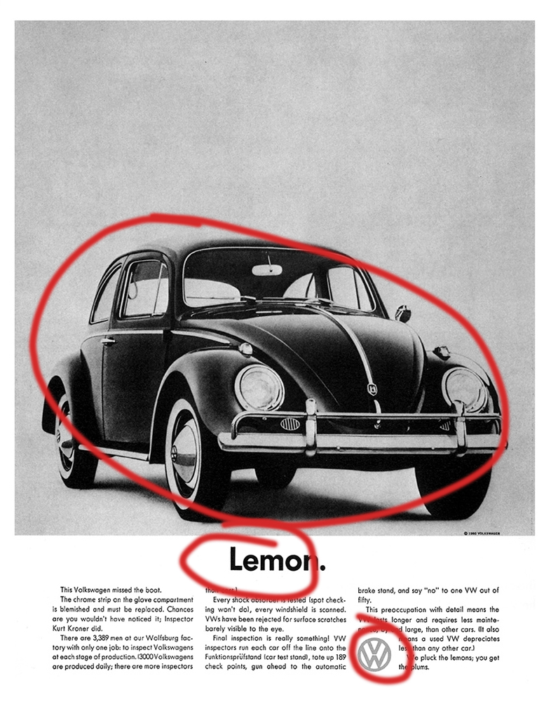
VW’s Think Small campaign, designed by Doyle Bernbach, is a staple when it comes to marketing and advertising. Bernbach used many radical designs for the time to create the ads. The quirkiness of the advertising matched that of the car. Because of this Think Small is one of the most successful advertising campaigns of all time; it was able to take Volkswagen from an obscure little German car to a major automobile manufacturer in the United States and around the world. This advertisement would make its subject car, the Beetle, the best selling car of its time and still to this day one of the most successful vehicles of all time.
In order to achieve the striking design, Bernbach did something that hadn’t really been done before in American marketing pre 1960. One of the radical designs was his use of contrast. He made the advertisement just black and white, a stark contrast to the standards of car advertising at the time. It also created a sharp contrast in the ad itself to have a little black VW in a sea of white blank space.
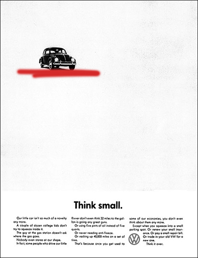
Within VW’s marketing there were many similar ads. They really used repletion across the whole range of ads making them instantly recognizable as a VW ad. They always featured a black and white car and then a title with some text underneath. This was the simple formula and Bernbach didn’t depart from this style.
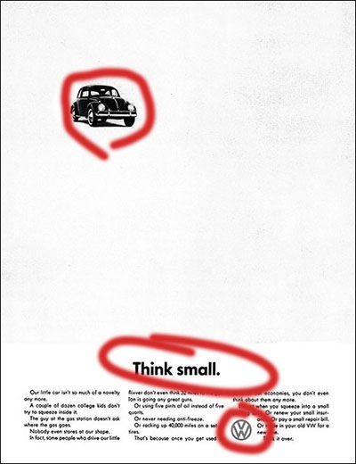
Doyle Bernbach did as much as he could to give the VW Think Small Ads an understated appeal. With his alignment he used the most common, and what is usually considered boring, alignment for his test. He just centered it. The only slightly out of the ordinary alignment within the ads was the VW logo aligned on left side of the text in the far right column.
Bernbach took a very unique stance with relation to proximity. He only used proximity with the text it was all in a paragraph from at the bottom and put the VW. However, the photo of the Beetle itself was kept far away from the rest of the ad, but because of the simplicity of the ad you know that it all relates.
Though all of the previously discussed items were quite radical for the time, the lack of color was the biggest shock to people. At the time, most car ads were very vibrant and colorful to show the luxury and how beautiful they were. But with the VW ads Bernbach decided to go for a minimalist and understated approach in the aforementioned was as well as in color, or the lack thereof. The ads were all printed in a barren black and white color scheme. This added to the minimalistic look of the ads.
Because how strikingly different the ads were to anything else at the time, they really caught peoples attention. They weren’t the most beautiful, they didn’t follow so closely the rules of visual media and design, or the trends of the time, but that is what makes them so great. They purposefully broke the rules and because of their willingness to go outside the box and do something so radically different they had immense success in building VW to what it is now, the largest automaker in the world!
This is an example post, originally published as part of Blogging University. Enroll in one of our ten programs, and start your blog right.
You’re going to publish a post today. Don’t worry about how your blog looks. Don’t worry if you haven’t given it a name yet, or you’re feeling overwhelmed. Just click the “New Post” button, and tell us why you’re here.
Why do this?
The post can be short or long, a personal intro to your life or a bloggy mission statement, a manifesto for the future or a simple outline of your the types of things you hope to publish.
To help you get started, here are a few questions:
You’re not locked into any of this; one of the wonderful things about blogs is how they constantly evolve as we learn, grow, and interact with one another — but it’s good to know where and why you started, and articulating your goals may just give you a few other post ideas.
Can’t think how to get started? Just write the first thing that pops into your head. Anne Lamott, author of a book on writing we love, says that you need to give yourself permission to write a “crappy first draft”. Anne makes a great point — just start writing, and worry about editing it later.
When you’re ready to publish, give your post three to five tags that describe your blog’s focus — writing, photography, fiction, parenting, food, cars, movies, sports, whatever. These tags will help others who care about your topics find you in the Reader. Make sure one of the tags is “zerotohero,” so other new bloggers can find you, too.
